Model/view framework
Many applications need to display data to the user. Applications may even allow user to manipulate and create new data. Qt model/view framework makes it easy for the developer to create such applications. The model is separated from the view, allowing several views to share the same model or one view to change the model on the on-the-fly.
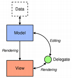
- Model is an adapter to the data and its structure. The actual data may be stored anywhere, for example in the database or some data center in the cloud. In trivial cases, the model itself can contain the data. QML contains several types for creating models, but for efficiency reasons a 'QAbstractItemModel' subclass is more frequently used.
- View displays the data in any kind of a visual structure, such as a list, table or path. There are views for stacking items StackView or scrolling large content ScrollView, but these views use internal models and provide a specialised API, so they are not covered here. Developers can create custom views as well to structure the UI in any way, they want.
- Delegate dictates how the data should appear in the view. The delegate takes each data item in the model and encapsulates it. The model data is accessible through the delegate.
Essential concepts
Dynamic views, like ListView, have a model and create and destroy delegate items dynamically to display data items. Any variant type can be assigned to the view's model property. In the following example, an integer 5 is assigned to the model, resulting that the view will create five delegates. As the model may be any variant type, it is possible to assign a JavaScript, QList, a QML model type or QAbstractItemModel subclass, which will be covered in the next phase.
ListView {
    anchors.fill: parent
    model: 5
    delegate: Component {
        Text {
            text: index
        }
    }
}
The delegate type is Component. Components define re-usable, well-defined QML types similarly to QML files, but the type is defined as an inline file. The view manages the delegate item life time. Different views use different strategies to manage the life time and we will return to this in Chapter Views. Note that delegate is a default property in ListView and often omitted in the declaration.
An index value is assigned to the text property. Where did the index come from. The view exposes several properties to all delegate items. The ìndex property is a context property, which means that each delegate item will have a different index value, even though the property name is the same. The first index is 0, the next one 1 and so on. This is a useful way to identify each delegate object.
Basic QML models
A simple and commonly used QML model type is ListModel, which is a container for ListElement definitions. In ListElement, the data is defined with named role definitions instead of properties, even though the syntax is the same. Note that the role names must be common with all other elements in a given model.
In the following example there are two roles, the name of a person and a color representing their team.
ListModel {
    id: teamModel
    ListElement { name: "Lars Knoll"; teamColor: "red" }
    ListElement { name: "Alan Kay"; teamColor: "lightBlue" }
    ListElement { name: "Trygve Reenskaug"; teamColor: "red" }
    ListElement { name: "Adele Goldberg"; teamColor: "yellow" }
    ListElement { name: "Ole-Johan Dahl"; teamColor: "red" }
    ListElement { name: "Kristen Nygaard"; teamColor: "lightBlue" }
}
The type of a role is fixed the first time the role is used. All roles in the previous example are string types. Dynamic roles allow assigning different types to roles as well. To enable dynamic roles, the 'ListModel' property 'dynamicRoles' must be set to true. The data that is statically defined, like in the previous example, cannot have dynamic roles. The data items with dynamic roles must be added with JavaScript.
The view exposes roles to delegate items, which can refer to roles by just using the role names as in the following example. If Text QML type contained a property called name, model qualifier must be used as a prefix to the role to avoid a name clash. An additional property modelData is exposed to delegates, if the model is a list.
ListView {
    anchors.fill: parent
    model: teamModel
    delegate: Text {
        text: name
        // text: modelData.name // in case there is a clash between roles and properties
    }
}
Create an empty Qt Quick Controls application.
-
Add a
ListModeland add at least oneListElement. The list element should have a fileUrl role, which refers to image file URLs. -
Add a
ListViewfilling the whole window area. -
Use a
BorderImagedelegate to show the images. All images can have a fixed size, e.g. 400 x 300 pixels.
Model manipulation
Creating and manipulating model data statically, as we did in earlier examples, is not scalable in real world applications. Data items can be manipulated in JavaScript, but more frequently C++ models are used as we will see in Phase 5. 'ListModel' has methods to append(), insert(), move(), and remove().
The following example shows, how to data to a ListModel with append:
ListModel {
    id: teamModel
    ListElement {
        name: "Team C++"
    }
}

MouseArea {
    anchors.fill: parent
    onClicked: {
        teamModel.append({ name: "Team Quick" })
    }
}
To create new items, you can use JSON { "teamName": "Team Qt", "teamColor": "green" } or JavaScript notation { teamName: "Team Qt", teamColor: "green" }. It should be noted that the first item inserted or declared to the model will determine the roles available to any views. In other words, if the model is empty and an item is added, only roles defined in that item are bound and used in subsequent added items. To reset the roles, the model needs to be emptied with the ListModel::clear() method.
This exercise is first of many during Part 4 where you add functionality to the PictureFrame application. It will not be tested in TMC, instead just start a fresh QML application and add things there every time a PictureFrame exercise comes up (this is first of 8, each part is worth 1 point, so total of 8 points are available). You can use the code from the last exercise as a starting point. The exercise will be returned as a GitHub repository to be peer-reviewed after the final part of it is done. You will then be graded based on which parts you did (i.e. if you get stuck you can skip one of the parts and continue).
Instructions: Add an action to menu to add and remove images from the model.
- The add image action should open a file dialog, where the user can choose multiple image files to be added to the model.
- The remove action should remove the last image from the model. Do not try to remove any image from an empty model.
-
Hint: Adding actions and a menu bar is easy, if you change
WindowtoApplicationWindow.
Threaded model manipulation
Modifying the model can be computationally expensive in some cases, and because we are doing it inside the UI thread, it can end up being blocked for quite a while. Consider a trivial case of creation 1,000,000 items into the model. Computationally heavy updates should preferably be done inside a background thread. For example, if we were to implement a Twitch chat client, we would run into performance problems very fast if we were to use the main thread for updating the message model:
TwitchChat {
    // signal messageReceived(string user, string message)
    onMessageReceived: {
        // Massage the received message data inside the signal handler ...
        // Remove old messages from backlog ...
        if (messageModel.count > 2147483647)
           messageModel.remove(0, 1337)
        // Append the message data to the model
        messageModel.append({"user": user, "message": message})
    }
}
Qt provides a QML type WorkerScript to offload any heavy data and model manipulation out of the main thread. Messages are passed between the parent thread and new child thread with the sendMessage() method and onMessage() handler:
TwitchChat {
    // signal messageReceived(string user, string message)
    onMessageReceived: {
        worker.sendMessage({"user": user, "message": message, "model": messageModel)
    }
}

WorkerScript {
    id: worker
    source: 'script.js'
}
The onMessage handler is implemented in the script.js file which is invoked when sendMessage() is called:
// script.js
WorkerScript.onMessage = function(msg) {
    // Massage the received message data ...
    // Remove old messages from backlog ...
    if (msg.model.count > 2147483647)
        msg.model.remove(0, 1337)
    // Append the message data to the model
    msg.model.append({"user": user, "message": message});
    msg.model.sync();    // Needs to be called!
}
Notice that the script.js file is not imported anywhere! This brings in the restrictions of this threading model: the source property is evaluated on its own outside of QML. This means any properties or methods, and all data needs to be passed to sendMessage(). The sendMessage() supports all JavaScript types and objects. Arbitrary QObject types are not supported, only the ListModel type. Also, if you want your modifications to take effect in the ListModel, you must call sync() on it on the worker thread.
Add yet another action to the menu. When triggered, the action should add 10,000 copies of one of the model fileUrls to the model.
- Obviously, the UI must be kept responsive all the time.
Exhaustive reference material mentioned in this topic
https://doc.qt.io/qt-5/qtquick-modelviewsdata-modelview.html
https://qmlbook.github.io/en/ch06/index.html
http://doc.qt.io/qt-5/qml-qtqml-models-listmodel.html
QML Models
There are several other QML model types inn addition to ListModel. XmlistModel allows construction of a model from an XML data source. It provides a very convenient way to parse XML data. ÒbjectModel contains the visual items to be used in a view. No delegate is required as the model already contains visual items. DelegateModel is useful in cases, where ´QAbstractItemModel index is used to access data items. The typical use case are hierarchical tree models, where the user needs to navigate up and down the subtree.
It is possible to use an object instance as a model as well. In this case, object properties are provided as roles as in the following example.
Text {
    id: myText
    text: "Hello"
    visible: false // we want to show the text in the view
}

Component {
    id: myDelegate
    Text { text: model.text } // the qualifier needed
}

ListView {
    anchors.fill: parent
    model: myText
    delegate: myDelegate
}
XmlListModel
XmlListModel is used to create a read-only model from XML data. It's a very convenient way to read data from RSS feeds and create a data model from relevant XML elements.
A simple XML structure could be the following:
<?xml version="1.0" encoding="utf-8"?>
<rss version="2.0">
    <channel>
        <item>
            <title>A blog post</title>
            <pubDate>Sat, 07 Sep 2010 10:00:01 GMT</pubDate>
        </item>
        <item>
            <title>Another blog post</title>
            <pubDate>Sat, 07 Sep 2010 15:35:01 GMT</pubDate>
        </item>
    </channel>
</rss>
The XML document contains tags (<rss>), which can have attributes (version="2.0"). Start tag <item> and end tag </item> form an element, and an element can have child elements. This basically means we have a tree of nodes, and we need to traverse the tree to extract data.
The following example shows, how to create a model from XML data.
import QtQuick 2.0
import QtQuick.XmlListModel 2.0

XmlListModel {
    id: xmlModel
    source: "http://www.mysite.com/feed.xml"
    query: "/rss/channel/item"

    XmlRole { name: "title"; query: "title/string()" }
    XmlRole { name: "pubDate"; query: "pubDate/string()" }
}
The source property defines the location for the XML document, which can be either local or remote resource.
The query property value should contain a valid XPath (XML Path Language) selector. Among other things, XPath is used to select nodes from the XML document tree that match a given path expression.
With the query of /rss/channel/item we select any <item> that are children of <channel> that are children of the document root element <rss> to be the items for the model. See XPath usage examples for more detailed usage.
The roles are defined with XmlRoles. Notice that the <item> elements contain other arbitrary elements, so we need a query to bind specific data. In the example, we query the <title> and <pubDate> elements inside the <item>, get their values with the string() function and bind the value to the aptly named roles title and pubDate. See XmlRole::query for more examples.
Using the generated models in ListView works as usual. The delegate can bind to model roles.
ListView {
    width: 180; height: 300
    model: xmlModel
    delegate: Text { text: title + ": " + pubDate }
}
Implement a news reader app. The news are available in http://feeds.bbci.co.uk/news/rss.xml. Any other feed may be used, but the feed must provide at least some text data + URLs to get further information.
-
Read all
itemstags from the feed. -
Get the news
titleandlinkfrom the news items. - The delegate should show the title and link in a column.
- When the user clicks on the delegate item, the link is opened in the Qt web engine.
-
Split the screen vertically between the view and web engine. Note that to be able to use the web engine in QML, you must call
QtWebEngine::initialize()in C++.
The tests for this exercise don't actually test much, submit it when you've accomplished the task. We'll do spot-checks to make sure you don't just return an empty program, so, remember to actually try :)
Object Model
ObjectModel defines a set of items rather than non-visual list elements. This makes it unnecessary to use delegates.
ObjectModel {
    id: itemModel
    Text { color: "red"; text: "Hello " }
    Text { color: "green"; text: "World " }
    Text { color: "blue"; text: "again" }
}

ListView {
    anchors.fill: parent
    model: itemModel
    orientation: Qt.Horizontal
}
Delegate Model
DelegateModel is similar to ObjectModel in that sense that it also encapsulates the model and delegate together. In addition, it is used in hierarchical models. Note that all QML model types are actually lists. Table, tree, and hierarchical models can be created by subclassing QAbstractItemModel. DelegateModel has a rootIndex property, which is a QModelIndex type. The model index allows navigating between child and parent items in the tree structure. This is covered in more detail in Phase 5.
DelegateModel is also useful for sharing data items to delegates in multiple views or for sorting and filtering items.
Sharing data items
DelegateModel uses a Package QML type to enable delegates with a shared context to be provided to multiple views. Any item within a Package may be assigned a name via the Package.name attached property, similarly to the following example. There are two items with different package names. The actual content Text is parented based on the delegate index to either a package, containing odd or to a package, containing even indices. The model myModel contains just list elements with a display role.
DelegateModel {
    id: visualModel
    delegate: Package {
        Item { id: odd; height: childrenRect.height; Package.name: "oddIndex" }
        Item { id: even; height: childrenRect.height; Package.name: "evenIndex" }
        Text {
            parent: (index % 2) ? even : odd
            text: display
        }
    }
    model: myModel
}
Now it is possible to use package names in different views. The DelegateModel property parts selects a DelegateModel which creates delegates from the part named.
ListView {
    height: parent.height/2
    width: parent.width
    model: visualModel.parts.oddIndex
}

ListView {
    y: parent.height/2
    height: parent.height/2
    width: parent.width
    model: visualModel.parts.evenIndex
}
Sorting and filleting data items
Delegates may be sorted and filtered using groups in DelegateView. Each delegate belongs to an items group by default. Additional groups can be defined using DelegateModelGroup QML type. It provides methods to create and remove items in the group or move items to a different index position inside the group.
The first step to use groups is to add one or more groups to DelegateModel. In the following example, there are two groups and by default all the delegate items are added to the group group1. Note that items are also added to the default items group, so any delegate may belong to several groups. The DelegateModel property filterOnGroup determines, we are interested in delegates in group1 only.
DelegateModel {
    id: visualModel
    model: myModel // contains ListElements with the display role
    filterOnGroup: "group1"

    groups: [
        DelegateModelGroup { name: "group1"; includeByDefault: true },
        DelegateModelGroup { name: "group2" }
     ]
For every group defined in DelegateModel two attached properties are added to each delegate item. The first of the form DelegateModel.inGroupName holds whether the item belongs to the group and the second DelegateModel.groupNameIndex holds the index of the item in that group.
The attached properties are useful in checking and changing the group, to which the delegate belongs to or to change the position of an item in that group. The following example shows, how the group can be changed by a mouse press.
delegate: Text {
    id: item
    text: display
    MouseArea {
        anchors.fill: parent
        onClicked: {
            if (item.DelegateModel.inGroup1) {
                item.DelegateModel.inGroup1 = false;
                item.DelegateModel.inGroup2 = true;
            }
            else {
                item.DelegateModel.inGroup1 = true;
                item.DelegateModel.inGroup2 = false;
            }
      }
   }
}
ListView {
    anchors.fill: parent
    model: visualModel
    focus: true
    Keys.onReturnPressed: {
        visualModel.filterOnGroup = (visualModel.filterOnGroup === "group1") ? "group2" : "group1";
    }
}
You have tons of pictures and your picture frame does not provide any support to organise images. Let's add support for at least viewing different image types in different views.
- Split the list view in PictureFrame to two list views horizontally.
-
Remove the delegate and create a new
DelegateModel. - Split images into two categories, e.g. .jpg and other images.
- One view should show .jpg files or whatever format you have chosen. The other view shows other images.
- Identify the image type from the file name extension.
Exhaustive reference material mentioned in this topic
https://doc.qt.io/qt-5/qtquick-modelviewsdata-modelview.html#xml-model
http://doc.qt.io/qt-5/qml-qtquick-xmllistmodel-xmllistmodel.html
https://qmlbook.github.io/en/ch06/index.html#a-model-from-xml
http://doc.qt.io/qt-5/xquery-introduction.html
http://doc.qt.io/qt-5/qml-qtqml-models-objectmodel.html
http://doc.qt.io/qt-5/qml-qtqml-models-delegatemodel.html
Views
For dynamic views QML provides four commonly used types, ListView, GridView, TableView, and PathView. First three inherit Flickable type, which enables users to flick content either horizontally or vertically. Note that there is a TableView type in Qt Quick Controls, but those types are deprecated and not covered here. PathView` allows organising data items in any path shape.
Each view may take any of the previously described QML model type and organise and decorate delegate items in the UI. All QML models are lists. TableView is the only type, which can directly show several columns from a C++ table model, i.e. QAbstractItemModel subclass. This is not any limitation though, as other views may use delegates, which display model columns, mapped to different roles.
In this chapter, we concentrate on use cases, where the view uses a QML model. C++ models are covered in Phase 5.
ListView
ListView organises delegates in a horizontal or vertical list. ListView provides a variety of ways to decorate lists. Data items may be grouped into sections for better visualisation. The list may have a special header and footer item, and a highlight, indicating the current item.
In the following example, the clip property is set to true. In QML, parent items do not clip their children, so children may paint outside the bounding box of a parent. In most cases, this is ok. However, if there is, e.g. a tool bar and list view in the same UI window, quite likely we do not want the list view items to be painted on the top of the tool bar. Settings clip to true clips children, which paint outside the list view area.
ListView {
    anchors.fill: parent
    clip: true
    model: 50
    delegate: someNiceDelegate
}
Attached properties
Each delegate gets an access to a number of attached properties, provided by the view. For example, ListView to which the delegate is bound is accessible from the delegate through the ListView.view property. Or a delegate can check, whether it is the current item by using ListView.isCurrentItem.
Attach properties allow implementing clean, re-usable delegates, which do not have direct bindings to the view via an id, for example.
The attached properties are available to the root delegate item. Child objects must refer to attached properties using the root delegate identifier as in the following example. Sometimes a new custom var property, bound to an attached property, id declared. Remember however that each additional property increases the memory consumption.
ListView {
    width: 300; height: 200
    model: contactsModel
    delegate: contactsDelegate

    Component {
        id: contactsDelegate
        Rectangle {
            id: rootWrapper
            width: 80
            height: 80
            // Rectangle is the root item, we can refer to the attached property directly
            color: ListView.isCurrentItem ? "black" : "red"
            Text {
                id: contactInfo
                text: name + ": " + number
                // Attached property is not accessible in the child
                color: rootWrapper.ListView.isCurrentItem ? "red" : "black"
            }
        }
    }

}
Sections
Grouping data items into sections improve readability in a list view. For example, albums grouped by artist names, or employees grouped by the department would easily show, which items are related.
When using sections, two properties need to be considered. In ListView the property section.property defines which property is used to divide the data into sections. It's important to note that the model needs to be sorted so that each property forming a section is continuous. If a property forming the section appears in multiple non-continuos places in the model, the same section might appear multiple times in the view. The second property to be considered is section.criteria. It's set to ViewSection.FullString by default, which means that the whole property is used as the section. If set to ViewSection.FirstCharacter only the first character in the property is used for the section, for example when dividing up a list of names to sections based on the first letter of the last name.
After the sections have been defined, they can be accessed from the items using the attached properties ListView.section, ListView.previousSection, and ListView.nextSection.
We can also assign a special section delegate to create a header before each section, by assigning it to the property section.delegate in the ListView.
In the following example, the data model has a list of artist and their albums, which are divided into sections by artist.
ListView {
    anchors.fill: parent
    anchors.margins: 20
    clip: true
    model: albumsAndArtists
    delegate: albumDelegate
    section.property: "artist"
    section.delegate: sectionDelegate
}

Component {
    id: albumDelegate
    Item {
        width: ListView.view.width
        height: 20
        Text {
            anchors.left: parent.left
            anchors.verticalCenter: parent.verticalCenter
            anchors.leftMargin: 10
            font.pixelSize: 12
            text: album
        }
    }
}

Component {
    id: sectionDelegate
    Rectangle {
        width: ListView.view.width
        height: 20
        color: "lightblue"
        Text {
            anchors.left: parent.left
            anchors.verticalCenter: parent.verticalCenter
            anchors.leftMargin: 6
            font.pixelSize: 14
            text: section
        }
    }
}

ListModel {
    id: albumsAndArtists
    ListElement { album: "Crazy World"; artist: "Scorpions"; }
    ListElement { album: "Love at First Sting"; artist: "Scorpions"; }
    ListElement { album: "Agents of Fortune"; artist: "Blue Öyster Cult"; }
    ListElement { album: "Spectres"; artist: "Blue Öyster Cult"; }
    ListElement { album: "The Vale of Shadows"; artist: "Red Raven Down"; }
    ListElement { album: "Definitely Maybe"; artist: "Oasis"; }
}
This time continue the PictureFrame application by adding sections to it.
-
Organise images into groups using
ListViewsections. - There is no need to group images in the model, so there may be any number of .tiff sections in the list view.
- Change the worker script as well to support sections.
Headers and Footers
Views allow visual customisation through decoration properties such as the header and footer. By binding an object, usually another visual object, to these properties, the views are decoraable. As an example, a footer may include a Rectangle type showcasing borders, or a header that displays a logo on top of the list. It should be noted that headers and footers don't respect the spacing property in ListView, and thus any spacing needs to be a part of the header/footer itself.
ListView {
    anchors.fill: parent
    anchors.margins: 20
    clip: true
    model: 4
    delegate: numberDelegate
    spacing: 2
    header: headerComponent
    footer: footerComponent
}

Component {
    id: headerComponent
    Rectangle {
        width: ListView.view.width
        height: 20
        color: "lightBlue"
        Text { text: 'Header'; anchors.centerIn: parent; }
    }
}

Component {
    id: footerComponent
    Rectangle {
        width: ListView.view.width
        height: 20
        color: "lightGreen"
        Text { text: 'Footer'; anchors.centerIn: parent; }
    }
}

Component {
    id: numberDelegate
    Rectangle {
        width: ListView.view.width
        height: 40
        border.color: "black"
        Text { text: 'Item ' + index; anchors.centerIn: parent; }
    }
}
Add a footer to the PictureFrame application.
- The footer should be always visible, if there are any items in the model. It should not go out of the view, when the list is scrolled.
-
The footer must not be overpainted by the view and it must show the url of the current image in a
LabelQt Quick Control.
Keyboard navigation and highlighting
When using a keyboard to navigate in the ListView, some form of highlighting is necessary to tell which item is currently selected. Two things are necessary to allow keyboard navigation in the ListView. First, the view needs to be given keyboard focus with the property focus: true, and second a special highlight delegate needs to be defined. This is demonstrated in the following example:
ListView {
    id: view
    anchors.fill: parent
    anchors.margins: 20
    clip: true
    model: 20
    delegate: numberDelegate
    spacing: 5
    highlight: highlightComponent
    focus: true
}

Component {
    id: highlightComponent
    Rectangle {
        color: "lightblue"
        radius: 10
    }
}

Component {
    id: numberDelegate
    Item {
        width: ListView.view.width
        height: 40
        Text {
            anchors.centerIn: parent
            font.pixelSize: 10
            text: index
        }
    }
}
The highlight delegate is given the x, y and height of the current item. If the width is not specified, the width of the current item is used.
Add a highlight into the PictureFrame application.
- The highlight should be a red ellipse, shown in the middle, right border of the image. You may add small margin that the ellipse does not overlap the border.
- The highlight size may be hard-coded, e.g. to 10 x 10 pixels.
- Animate the highlight position change using an out bounce easing curve.
GridView and TableView
GridView is largely similar to ListView, and it's used in almost the same way. The main difference is, that it doesn't rely on spacing and size of delegates, and instead cellWidth and cellHeight are defined in the view. Header, footers, keyboard navigation with highlighting are all available in GridView. Orientation is set in the flow property, options being GridView.LeftToRight (default) and GridView.TopToBottom. The following example showcases the usage of GridView.
GridView {
    id: grid
    anchors.fill: parent
    cellWidth: 80;
    cellHeight: 80
    model: 100
    delegate: numberDelegate
    highlight: Rectangle { color: "lightsteelblue"; radius: 5 }
    focus: true
}

Component {
    id: numberDelegate
    Item {
        width: grid.cellWidth
        height: grid.cellHeight
        Text {
            text: index
            anchors.horizontalCenter: parent.horizontalCenter
            anchors.verticalCenter: parent.verticalCenter
        }
    }
}
TableView can display multiple columns, provided that the underlying model has multiple columns. There is no QML model type with multiple columns, so the model must inherit QAbstractItemModel.
The GridView and TableView exercise is postponed to Phase 4, where we compare how the views manage the lifetime of delegates.
PathView
PathView is the most powerful and customisable of the dynamic views provided by QML. PathView will display the model data on a Path that can be arbitrarily defined with the Path QML type. PathView can be customised through a wide variety of properties, such as pathItemCount, which controls the numbers of visible items at once, and preferredHighlightBegin and preferredHighlightEnd, which are used to control where along the path the current item is shown. The properties expect real values between 0 and 1. Setting both of them to, for instance, 0.5 would display the current item at the location 50% along the path.
A Path is the path that the delegates follow when the view is scrolled. It defines the path using startX and startY properties, alongside path segments that are defined types such as PathQuad or PathLine. All the different path segments can be found in the Qt documentation. Qt Quick Designer commercial version even has an editor to create and remove path segments and define their shapes.
The following example shows items on a straight path.
PathView {
    id: view
    model: 20
    anchors.fill: parent

    path: Path {
        startX: 0
        startY: height

        PathCurve {
            x: view.width
            y: 0
        }
    }
    delegate: Text {
        text: "Index " + index
    }
}
When the path has been defined, we can further tune it using PathPercent and PathAttribute types. These objects can be placed in between the path segments to provide a more fine grained control over the path and the delegates. The PathPercent allows you to manipulate the spacing between items on a PathView's path. You can use it to bunch together items on part of the path, and spread them out on other parts of the path. The PathAttribute object allows attributes consisting of a name and a value to be specified for various points along the path. The attributes are exposed to the delegate as Attached Properties, and can be used to control any property. The value of an attribute at any particular point along the path is interpolated from the PathAttributes bounding that point.
Next we have a larger example of PathView, where the path is defined with PathQuad and the size and opacity of the items is changed with PathAttribute. We've also enabled keyboard navigation, which is not available by default. It can be done by giving the keyboard focus by setting the focus property to true, and defining what the keys should do (in this case Keys.onLeftPressed: decrementCurrentIndex() and Keys.onRightPressed: incrementCurrentIndex() to allow moving back and forth).
// ContactModel.qml
ListModel {
    ListElement { name: "Linus Torvalds"; icon: "pics/qtlogo.png"; }
    ListElement { name: "Alan Turing"; icon: "pics/qtlogo.png"; }
    ListElement { name: "Margaret Hamilton"; icon: "pics/qtlogo.png"; }
    ListElement { name: "Ada Lovelace"; icon: "pics/qtlogo.png"; }
    ListElement { name: "Tim Berners-Lee"; icon: "pics/qtlogo.png"; }
    ListElement { name: "Grace Hopper"; icon: "pics/qtlogo.png"; }
}
Rectangle {
    width: 250; height: 200

    Component {
        id: delegate
        Item {
            width: 80; height: 80
            scale: PathView.iconScale
            opacity: PathView.iconOpacity
            Column {
                Image { anchors.horizontalCenter: nameText.horizontalCenter; width: 64; height: 64; source: icon }
                Text { id: nameText; text: name; font.pointSize: 12 }
            }
        }
    }

    PathView {
        anchors.fill: parent
        model: ContactModel {}
        delegate: delegate
        focus: true
        Keys.onLeftPressed: decrementCurrentIndex()
        Keys.onRightPressed: incrementCurrentIndex()
        path: Path {
            startX: 120
            startY: 100
            PathAttribute { name: "iconScale"; value: 1.0 }
            PathAttribute { name: "iconOpacity"; value: 1.0 }
            PathQuad { x: 120; y: 25; controlX: 260; controlY: 75 }
            PathAttribute { name: "iconScale"; value: 0.3 }
            PathAttribute { name: "iconOpacity"; value: 0.5 }
            PathQuad { x: 120; y: 100; controlX: -20; controlY: 0 }
        }
    }
}
When using Image QML type in the PathView delegates, it is useful to bind the smooth property to PathView.view.moving. Less processing power is spent on smooth transformations, when the view is in motion, while images are smoothly transformed when stationary.
Let's improve the photo browsing in the PictureFrame application. As images are hard-coded to be quite large, it's difficult to quickly find the right picture. Let's add a PathView to improve the browsing functionality.
- Split the window horizontally into to equal size areas. Keep the list view on the left and add path view to the right.
- Implement the path view into its own file.
- Implement a U-shape path using three path lines. The first line goes diagonally down from the top left corner. The second path line goes horizontally to the right and the third line goes diagonally to the top right corner.
- Change the delegate opacity and size to 50 per cent in diagonal lines.
Exhaustive reference material mentioned in this topic
https://qmlbook.github.io/en/ch06/index.html
https://doc.qt.io/qt-5/qml-qtquick-listview.html
https://doc.qt.io/qt-5/qml-qtquick-gridview.html
https://doc.qt.io/qt-5/qml-qtquick-pathview.html
https://doc.qt.io/qt-5/qml-qtquick-tableview.html
Delegates
Delegates act as templates for instantiating the visual items inside the view. The data roles provided by the model are bound to visual item properties, such as the Text.text or Image.source property. Delegates can also be used to modify and update the data bound to the roles by simply assigning new values to roles. The model will notify all views about the changed data values.
In the following example, we have a TeamDelegate that updates the bound data when clicked:
ListModel {
    id: teamModel
    ListElement {
        teamName: "Team C++"
        teamColor: "blue"
    }
}

ListView {
    anchors.fill: parent
    model: teamModel
    delegate: TeamDelegate {}
}

// TeamDelegate.qml
Component {
    Text {
        text: teamName
        color: teamColor

        MouseArea {
            anchors.fill: parent
            onClicked: {
                    model.teamName = "Team Quick"
                    model.teamColor = "red"
                }
            }
        }
    }
}
Within the delegate, it is possible to access the data roles as internal properties. Remember also the model qualifier, if the delegate item property names and model roles have a name clash.
Delegate size
In most examples so far, we have used Text or Image QML types for delegates. These types have implicit size, so there has not been any need to define the size explicitly using the Item::width and Item::height properties. In fact, using the implicit size and setting the explicit size in Text incurs a performance penalty as the text must be laid out twice.
In real application, delegates seldom contain just a text or an image. More often delegates are composed from a few other QML types. As delegates are components, they must contain exactly one root item. The Item QML type is a good candidate for the root item, as it's suitable for composing delegates from other items. However, Item has no explicit size, so it has to be explicitly declared.
One approach is to bind the root item size to the view size. In the following example, we bind the delegate height to the height available for one item, assuming the model has n items. To keep the text readable, we have used FontMetrics to calculate the minimum height for the delegate.
ListView {
    anchors.fill: parent
    anchors.margins: 20
    clip: true
    model: 50
    delegate: numberDelegate
}

FontMetrics {
    id: fontMetrics
    font { family: "Arial"; pixelSize: 14 }
}

Component {
    id: numberDelegate
    Item {
        width: ListView.view.width
        height: Math.max(ListView.view.height / ListView.view.count, fontMetrics.height)

        Rectangle {
            anchors.fill: parent
            border.color: "black"
            Text {
                font { family: "Arial"; pixelSize: 14}
                text: 'Item ' + index;
                anchors.centerIn: parent;
            }
        }
    }
}
Another approach is to let the delegate children determine its size. This is useful, if children have implicit size like the Text item in the following example.
Component {
    id: numberDelegate
    Item {
        id: rootItem
        width: ListView.view.width
        height: childrenRect.height


        Rectangle {

            width: rootItem.width
            height: childrenRect.height + 2
            border.color: "black"
            Text {
                font { family: "Arial"; pixelSize: 14}
                text: 'Item ' + index;
            }
        }
    }
}
Keep your delegates as simple as possible. This applies to size calculation as well. Avoid complex size calculations and dependencies between delegate objects.
Let's change the PictureFrame exercise from the previous chapter to have little bit more complicated delegate. This will not be the best way to implement the delegate, but it's used for learning purposes. The goal is the understand, how delegate size should be determined.
-
Let's modify the path view delegate. The delegate root should be an
ItemQML type. -
The item should contain one child, which is
Column, which is shown immediately below the border image. - The column contains the border image and a rectangle, which has a label as a child. The rectangle should use the image width and label height. The label is entered in the rectangle.
- The only hard-coded size can be the border image. It's totally acceptable to make the border image scalable as well, but it's not required in the exercise.
-
All other delegate objects must have either implicit size or the
widthandheightproperties bound to other properties. No hard-coded magic numbers are accepted.
This is the final part of Picture Frame exercise series. Now it's time to submit it to be peer-reviewed. This is done in the same manner as with the Directory Browser exerice at the end of Part 2. Create a GitHub repository for your project, and submit a link to it below.
Clip
The view clip property will ensure that any view items outside of the view will not be visible. If set to false, items will 'flow over' the view. Avoid using clip in delegates. If clip is enabled inside a delegate, each delegate will be batched separately. The QML renderer creates a scene graph of all the visible items. It tries to minimise the number of OpenGL state changes, by batching paint operations. One batch contains only operations, which do not require an OpenGL state changes. Less batches result to better rendering performance.
Clipping results that a scene graph node and its complete sub-tree will be put into one batch. If clip is used in the view, but not in the delegates, the whole tree of the view and delegates can be put into one batch. However, as soon as a delegate uses clip, a new scene graph sub-tree is created for each delegate. this will increase the number of batches and have negative impact on the performance.
Scenegraph renderer describes batching in more detail.
This is a voluntary exercise that will not be graded. We still recommend you do it though, the goal is to get familiar with the utilities to find and optimise batches in QML application!
-
Define an environment variable
QSG_RENDERER_DEBUG=renderand run your PictureFrame application in Qt Creator in Debug Mode. You will see the number of batches sent to OpenGL in Debug Console. -
Use the
QSG_VISUALIZEenvironment variable to visualise the batches. The variable may have one of the four values:batches,clip,overdraworchanges. Set theclipproperty totruein your view. Check, if this affects the number of batches in any way.
Memory management
Dynamic views create and destroy delegates dynamically. The only exception is TableView, which is able to re-use existing delegates from the pool as well. TableView has the reuseItems property to control this.
ListView, GridView, and PathView will create as many delegate items, as the view is able to show in its area. This allows Qt developers to use huge item models, consisting of millions of items, as only a small portion of items is visible and created at one time. When a user flicks the view, visible items go beyond the view are and they are destroyed. New items will be created and they become visible in the view.
Dynamic creation of items implies you must never store state information into a delegate. Always store the state information into the model, before the item is destroyed.
Component.onDestruction: {
    someBooleanRole = (state === "false") ? false : true;
}
Views provide caches to improve the performance, when the user is flicking the view. ListView and GridView use cacheBuffer, while PathView uses cacheItemCount. PathView::pathItemCount determines how many visible items are created and PathView::cacheItemCount determines how many additional items are created in the cache. Caching delegate items improves the performance, but increases the memory consumption.
The property cacheBuffer is an integer, determining how many delegate items are cached. If the value is 100 in a list view and the delegate height is 20, 5 items will be cached before and 5 items will be cached after the currently visible items.
In GridView, the caching principle is similar. If in a vertical view the delegate is 20 pixels high, there are 3 columns and cacheBuffer is set to 40, then up to 6 delegate items above and 6 delegate items below the visible area may be created or retained.
TableView can also reuse delegate items. When an item is flicked out, it moves to the reuse pool, which is an internal cache of unused items. When this happens, the TableView::pooled signal is emitted to inform the item about it. Likewise, when the item is moved back from the pool, the TableView::reused signal is emitted.
Any item properties that come from the model are updated when the item is reused. This includes index, row, and column, but also any model roles.
Avoid storing any state inside a delegate. If you do, reset it manually on receiving the TableView::reused signal.
If an item has timers or animations, consider pausing them on receiving the TableView::pooled signal. That way you avoid using the CPU resources for items that are not visible. Likewise, if an item has resources that cannot be reused, they could be freed up.
The following example shows a delegate that animates a spinning rectangle. When it is pooled, the animation is temporarily paused.
Component {
    id: tableViewDelegate
    Rectangle {
        implicitWidth: 100
        implicitHeight: 50

        TableView.onPooled: rotationAnimation.pause()
        TableView.onReused: rotationAnimation.resume()

        Rectangle {
            id: rect
            anchors.centerIn: parent
            width: 40
            height: 5
            color: "green"

            RotationAnimation {
                id: rotationAnimation
                target: rect
                duration: (Math.random() * 2000) + 200
                from: 0
                to: 359
                running: true
                loops: Animation.Infinite
            }
        }
    }
}
Let's compare, how grid view and table view manage the delegate lifetime.
- This exercise isn't tested, so submit it when you've done what's asked. We'll do spot-checks on the submits, so please at least try and do the exercise. Completely empty submissions will not be tolerated.
- Start from scratch, you're provided with an empty main.qml.
-
Split the window horizontally between a
GridViewandTableView. Use Qt QuickTableView, introduced in Qt 5.12. -
Create an empty
ListModel. Fill the list model with 100 element. Each element has two roles: "name" and "buttonChecked". The name value could be just an index and buttonChecked should be initially false. Assign to model to both views'modelproperty. You may findComponent.onCompletedsignal handler very useful. After the window is created, use the handler to fill the model. -
Create two delegates: one for the grid view and another one for the table view. You can use similar delegate declaration in both cases. Add a
Rowof aRadioButtonandText. SetRadioButton::autoExclusiveto false in both delegates. Otherwise. we cannot uncheck the checked radio button. TheText::textproperty should have the "name" role, defined in the model.ButtonCheckedrole is not used yet. -
Add
Component::onCompletedsignal handler to both delegates and useconsole.logto notify about the delegate creation. Flick the grid view and table view up and down. What do you observe? How delegate creation differs between the views? - Check one radio button in the grid and one in the table. Scroll down the both views? What do you observe?
-
We need to store the radio button state into the model. That's why we have the
buttonCheckedproperty. First, bindRadioButton::checkedtobuttonChecked. Now, you should see that checking a radio button in one view checks the radio button in other view, as they share the same model. - Finally, save the radio button state changes to the model. If you now scroll down and up, you should observe that the radio button state does not change or the table view does not have any re-used radio buttons in the wrong state.
Complex delegates
Keep your delegates as simple as possible. There are ways to manage complex delegates, but almost always the best solution performance and memory consumption wise is to declare simple delegates.
Why should delegates be so simple then? Problems arise when delegates contain, for example Video items all auto-playing video for some odd reason.
Item {
    id: videoDelegate

    Video {
        id: video
        width: 800
        height: 600
        source: model.videosrc
        autoPlay: true
    }
}
The target platform is low-end devices, and loading all these items at startup will take an noticeable amount of time. Some devices might not be able to play multiple video sources at the same time.
If there is a need to load resource intensive items inside a delegate, it is possible to create objects dynamically, as explained in Dynamic object creation.
QML has the Loader type, which can be used to load different parts of the UI, like complicated parts of delegates, to improve performance. The following example has a delegate which has a Component where the video will be contained. We add a Loader and a MouseArea to the delegate, so when clicked the sourceComponent property will be set to the videoComponent. This change will trigger the Loader to load the videoComponent component.
Item {
    id: lazyVideoDelegate

    width: 200
    height: 200

    Component {
        id: videoComponent

        Video {
            id: video
            width: 800
            height: 600
            source: model.videosrc
            autoPlay: true
        }
    }

    Loader {
        id: videoLoader
    }

    MouseArea {
        anchors.fill: parent
        onClicked: videoLoader.sourceComponent = videoComponent
    }
}
Notice that while a Video item declared by itself would be automatically rendered and displayed, this is not the case for the above as the item is defined inside a Component.
This will reduce the load time considerably, as the delegate will only contain Loader and MouseArea objects initially. Note however that we have to create a Loader object, which is not free. It is lighter, but consumes memory anyway. The better way is to try to avoid Loaders in delegates. The best approach would be to add an Image which displays a thumbnail of the video or something similar.
In this part, we have concentrated on dynamic views. What are the static views then? Positioners are static views. The Repeater QML type is often used to statically create content for positioners. The idea is similar to the dynamic views. Repeater uses delegate templates to create objects, but all objects are created synchronously.
-
You are given the
MemoryIntensiveElementQML file. Themain.qmlempty, use to it to do the following: -
Use
MemoryIntensiveElement::nofItemsproperty to create e.g. 150,000 delegates. The time required for the creation depends on your computer resources, so adjusted the number so that the startup time is at least several seconds. -
Your task is simple. Reduce the startup time with asynchronous loading. You MUST not change anything in
MemoryIntensiveElement. - Again, this exercise isn't tested, so just submit it when you think you've done what's required. We'll do spot-checks to make sure that you've at least tried.
Exhaustive reference material mentioned in this topic
http://doc.qt.io/qt-5/model-view-programming.html
https://qmlbook.github.io/en/ch06/index.html#delegate
https://www.quora.com/What-are-delegates-in-Qt
https://doc.qt.io/archives/qq/qq24-delegates.html
http://doc.qt.io/qt-5/qitemdelegate.html
https://www.ics.com/designpatterns/book/delegates.html
http://doc.qt.io/qt-5/qitemdelegate.html#details
Exercise for Part 4 - TV Guide
This is another peer-reviewed exercise. After you're done, create a repository for your solution on GitHub, and submit it to be peer-reviewed below. Please note that to get the points for this exercise, you're required to review another student's solution! You can download an example solution and do the peer-review after you've submitted your own solution.
Your task is to implement a TV Guide application. The application allows the user to browse TV programs from several channels. One source for the channel and program data is Telkussa, but obviously any other services can be used.
- The application should show TV programs of at least ten channels.
- Organise channels in a vertical list.
- Each row in the list should show at least the channel name and the current date's TV programs. Display the TV programs in a horizontal list, organised in a chronological order.
- If a TV program name is clicked on, show more detailed description of the program. QML dialogs could be used for this.
- Do not try to implement everything in a single source code file. Keep models and views in their own files.
-
Avoid hard-coded magic numbers. Make at least the view sizes scalable. The font and image sizes may be fixed.